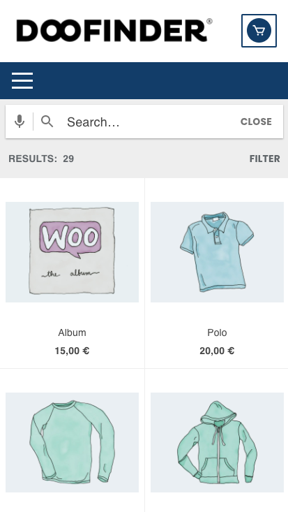
This article shows how to customise your mobile layer to integrate it with your brand and style code.
Doofinder Mobile Layer seamlessly integrates into your webpage. It is, therefore, part of your webpage HTML structure. You can access and modify any element within the Doofinder layer using CSS rules and selectors.
Before we get started, there are a few pointers to consider:
- Doofinder Mobile Layer is loaded in screens with a width lower than 767 pixels. You can modify this width to show it on tablets. Click here for further info.
- In general, Doofinder has distinctive CSS classes for each element. That means, for example, every result has the .df-card class, and the title has the .df-card__title class. You can use those selectors to customise styles.
- To make customisation easier, you can inspect your site’s HTML structure via your browser’s developer tools. That will help you find the specific class of the element you want to modify.
- You can specify different styles for your desktop and mobile versions. To do this, you should use the .df-mobile to specify you are customising the mobile version. Take a look at the class hierarchy below.
📌 Note: If you want to redesign the mobile layer template completely, see this article.
Layout
All Doofinder layers share almost the same layout with some differences.
.df-mobile
  .df-mobile__wrapper
    .df-mobile__header
      .df-mobile__header__image (optional)
      .df-mobile__searchbox
      .df-mobile__header__actions (optional)
    .df-mobile__content
    .df-mobile__action-button
  .df-mobile__overlay
  .df-mobile__aside
You can think of all these classes as components:
df-mobile__header: contains the header, included the search box..df-mobile__header__image: holds a branding image..df-mobile__searchbox: holds the search box..df-mobile__content: The main content of the layer..df-card: Each search result has this class, e.t.c.
📌 Note: The Mobile layer adds extra classes and IDs to allow for more specific customisations.
Learn by example
Add branding images to the Mobile Layer
The latest version of the mobile layer adds support for header and body images in the default template, so customising the layer to your branding is easier.

You only have to add the URL of your images to the templateVars display attribute of the mobile options inside your Doofinder Script:
var dfClassicLayers = [{
  ... (other layer options)
  mobile: {
    display: {
      templateVars: {
        images: {
          header: 'http://yoursite.com/media/logo.png',
          body: 'http://yoursite.com/media/watermark.png'
        }
      }
    }
  }
}]
You can see more info about these and other mobile configuration options at this reference.
Change the colour of the title in the results
df-mobile .df-card__title{
  color: #FFBBCC;
}
Change the left margin for each item’s price
.df-mobile .df-card__price {
  margin-left: 20px;
}
We can also lower the Doofinder layer to keep the header of the website.
The CSS to use in this case will be:
.df-mobile {
    top: 143px!important;
}
The top value should be modified, depending on how low the layer should be moved.

Should you encounter any problems, please contact support@doofinder.com.
Last Updated: July 2021