The add to cart button might seem like just a small part of online shopping, but it’s actually a big deal.
Think about it: it’s the one thing standing between a shopper browsing your site and actually making a purchase. That little button has a lot of power.
In this blog post, we’re going to talk all about mastering the add to cart button.
We’ll cover why it’s so important for your online store, and we’ll give you some practical tips on how to make yours as effective as possible.
So if you’re ready to boost your sales and make the most of your eCommerce site, stick around.
We’ve got some good stuff coming your way.

What is an Add to Cart Button?
An add to cart button is the button that lets customers add items they want to buy to their shopping cart. Seems simple, right?
But don’t let its simplicity fool you – this button is a big deal when it comes to the online shopping journey.
Think about it like this: when someone visits your online store, they’re not just there to look around – they’re there to buy something.
And the shopping cart button is the first step in making that happen. It’s the gateway to turning a visitor into a customer.
That’s why it’s so important to get your add to cart button right.
A well-thought-out add to cart design can make the shopping experience smooth and intuitive, while a poorly designed one can frustrate customers and send them running to your competitors.
In the next section, we’ll dive into some best practices for designing effective add to cart buttons that encourage shoppers to take that next step and make a purchase.
So stay tuned – we’ve got some valuable tips coming your way.
14 Add to Basket Button Best Practices
1. Craft Unique Value Propositions
Your add to cart button is more than just a functional element – it’s a prime opportunity to showcase what sets your product apart.
Highlight special offers like free shipping, limited-time discounts, or exclusive features right next to the button.
This could be a brief mention of your value proposition or promotions that make your product stand out from the competition.
2. Utilize Visual Cues
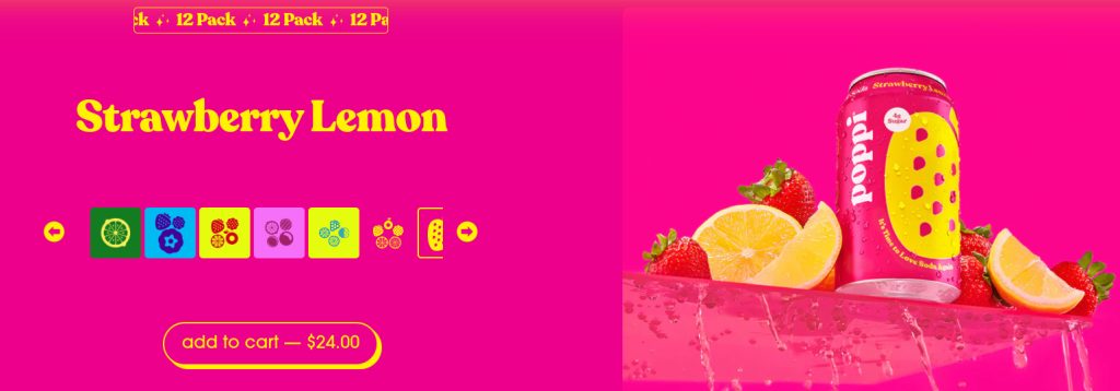
Make sure your add to cart design catches the eye with visual cues.
Experiment with contrasting colors, bold fonts, or eye-catching icons to draw attention to the button.
Your add to cart UI should stand out from the rest of your website’s design, making it easy for shoppers to spot and click.
3. Create Urgency
Encourage shoppers to act fast by creating a sense of urgency around your add to cart button.
Use tactics like limited stock alerts, countdown timers, or flash sales to nudge hesitant buyers into making a decision.
Clearly communicate the scarcity of the product to prompt immediate action.
4. Optimize Placement
Where you position your add to cart button matters.
Place it where shoppers expect to find it, usually near the product description or alongside prominent images.
Ensure it’s easily accessible without the need for scrolling, reducing friction in the buying process.
Test different placements to find the most effective location for driving conversions.
5. Experiment with Button Text
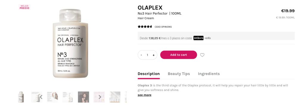
Don’t settle for the standard add to cart text – get creative!
Try out intriguing phrases like “Get Yours Now” or “Add to Bag” to pique curiosity and boost clicks.
Test different variations like “Buy Now” or “Shop Now” to see what resonates best with your audience.
Use action-oriented language to create a sense of urgency or excitement that encourages shoppers to take action.
6. Harness the Power of Numbers
Numbers can be powerful motivators.
Incorporate numerical values like discounts, savings percentages, or limited stock quantities directly into your add to cart button or nearby.
Clearly communicate the value proposition to entice shoppers and prompt them to make a purchase.
7. Embrace Rounded Edges
Give your button a sleek and modern look by opting for smooth, rounded edges.
This add to cart design adds a polished touch that complements your website’s overall aesthetic.
Make sure the button stands out visually while still blending in seamlessly with your site’s design.
8. Automate Out-of-Stock Updates
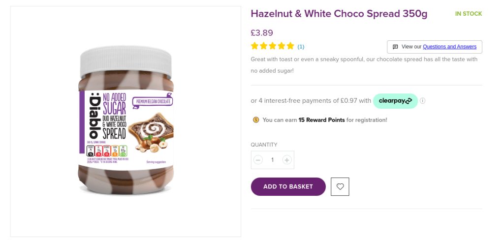
Keep your customers in the loop by automatically updating the add to cart button text or disabling it when items are out of stock.
Transparency is key to building trust and preventing frustration among shoppers.
Let them know upfront if an item is unavailable, so they can make informed decisions about their purchase.
9. Implement Upselling Strategies
Boost your average order value by suggesting related products, complementary items, or bundled deals that enhance the shopping experience.
By showcasing items that complement what the customer is already purchasing, you can encourage them to add more to their cart, increasing your sales in the process.
10. Showcase Social Proof
Build trust and confidence in your products by displaying reviews, ratings, or testimonials near the add to cart button.
Positive feedback from other customers reinforces the decision to make a purchase, helping to alleviate any doubts your potential buyers may have.
11. Add Hover Effects
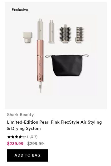
Enhance user interaction by incorporating subtle hover effects that indicate button responsiveness, such as color changes or animations.
These visual cues can make the add to cart UI feel more interactive and engaging, encouraging users to click through and complete their purchase.
12. Opt for Tappable Design
Ensure a user-friendly experience, especially on mobile devices, by designing tappable elements for easy selection.
If you offer multiple product options, making them easy to tap and select can streamline the shopping process and reduce friction for your mobile users.
13. Test for Usability
Regularly assess the performance of your add to cart button through usability testing.
Analyze key metrics like click-through rates and conversion rates to pinpoint areas for improvement and optimize the button for maximum effectiveness.
Continuous testing allows you to refine your approach and ensure a smooth shopping experience for your customers.
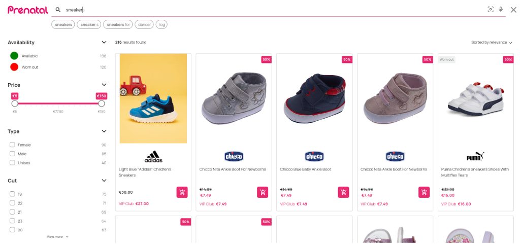
14. Implement into the Search Results
Streamline the online shopping experience by adding add to cart buttons directly onto product cards in the search interface.
This enables quicker checkouts, leading to faster sales and a more efficient browsing process for customers.
8 Add to Cart Button Examples
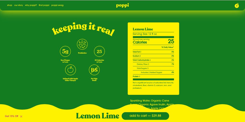
1. Poppi’s Pop-up Footer Add to Cart Button
Poppi uses a pop-up footer for one of its add to cart buttons, making it easily accessible regardless of the user’s position on the page.
This ensures constant visibility, encouraging more spontaneous purchases especially for quick-decision products like beverages.
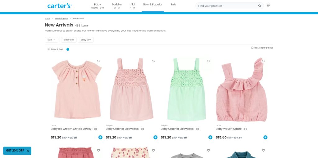
2. Carter’s Minimalistic Add to Cart Button
Carter’s opts for a minimalistic add to cart design that blends seamlessly with the site’s aesthetic, reducing visual clutter.
This helps focus the customer’s attention on the product rather than the purchasing process, thereby subtly guiding them towards making a purchase.
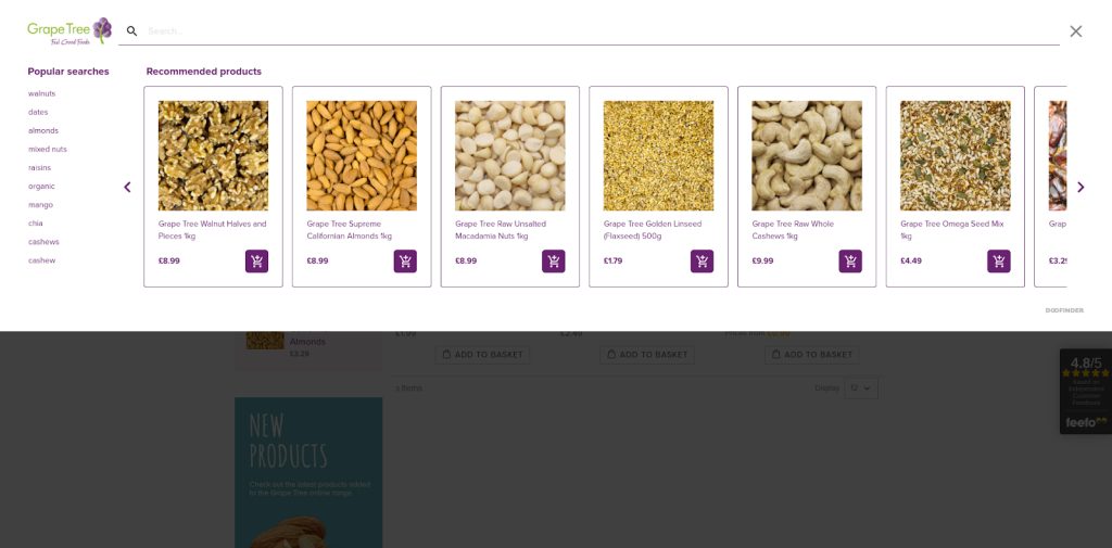
3. Grapetree’s Search Bar Integrated Add to Cart Buttons
Grapetree integrates add to cart buttons directly into search results, allowing users to quickly add items to their cart without navigating away from the page.
This streamlines the shopping process and can lead to higher conversion rates as it minimizes the steps needed to make a purchase.
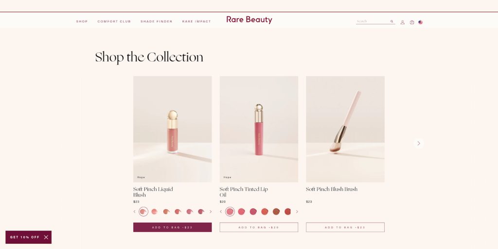
4. Rare Beauty’s Price Transparent Add to Cart Buttons
Rare Beauty displays the price clearly on the add to basket button, promoting transparency and trust.
This can be particularly effective for beauty products where customers might be comparing multiple options based on price and value.
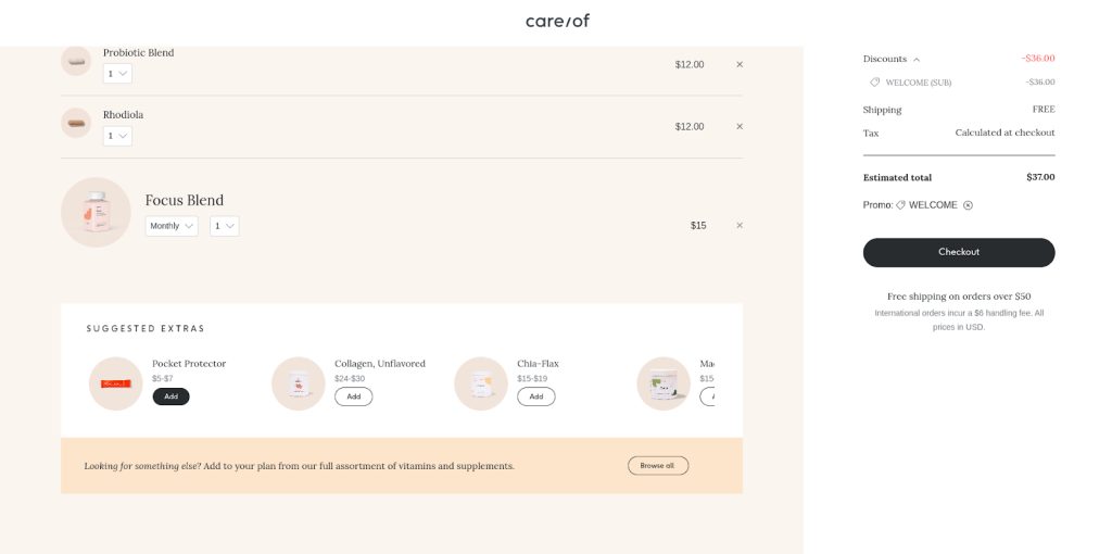
5. Care/of’s Cross-Selling Checkout Add to Cart Buttons
Care/of cleverly uses its add to cart button in the checkout process to promote cross-selling.
By suggesting related products at the checkout, it personalizes the shopping experience and increases the average order value.
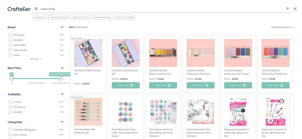
6. Craftelier’s Stock-Optimized Add to Cart Buttons
Craftelier’s add to cart buttons are optimized to appear only when the product is in stock.
This provides transparency to users and helps decrease frustration in the checkout process.
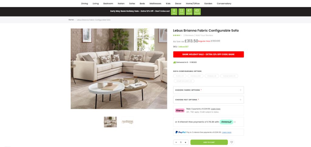
7. Furniture Direct UK’s Add to Cart Button with Multiple Payment Options
This approach provides customers with flexibility in how they wish to pay by displaying various payment methods directly above the add to cart button.
Multiple payment options can lower the barrier to completing a purchase, appealing to a broader audience.
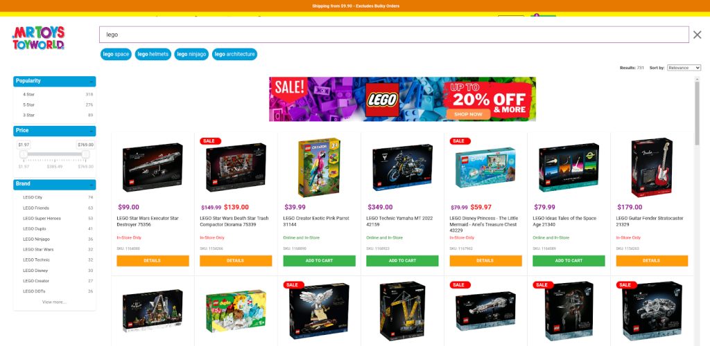
8. Mr. Toy’s Toyworld’s In-Search Online and In-Store Optimized Add to Cart Button
Mr. Toy’s Toyworld displays the add to cart button in one color for products available for online purchase.
However, for in-store-only products, there’s no add to cart button; instead, there’s a “details” button in a different color.
This distinction allows shoppers to easily differentiate between products available for immediate online purchase and those exclusively available in-store.
Adding Add to Cart Buttons to Your Online Store
To wrap things up, we’ve covered why the add to cart button is so crucial for your online store’s success. It’s the bridge between browsing and buying, making it essential to get it right.
Now, it’s time to take action. Implement the strategies we’ve discussed to make your add to cart button more effective.
And if you’re looking for a solution to seamlessly integrate add to cart buttons into your search results and product cards, consider Doofinder’s search and discovery solution.
By focusing on your add to cart button and making it as user-friendly as possible, you can create a better shopping experience for your customers and drive more sales.


