If you’ve landed on this page, you’re gearing up to launch your eCommerce store. Or you’ve launched already, and things aren’t going as planned. Maybe traffic is low. Maybe you’re getting visitors, but nobody’s buying. Maybe they add to cart, only to vanish at checkout. Or worse — send the goods back a few days later.
Well, you’re not alone. Many eCommerce businesses face the same silent killers: low online visibility, high bounce rates, low conversions, and high return rates that chip away at margins.
The good news is they’re all avoidable and fixable. This guide walks you through 30 proven eCommerce website best practices to help you seal the gaps and turn more visitors into customers.
Product Page Best Practices
Your product page is the final stop before the cart. Here’s how to make every detail — visual, textual, and functional — push shoppers toward a confident “Add to Cart.”
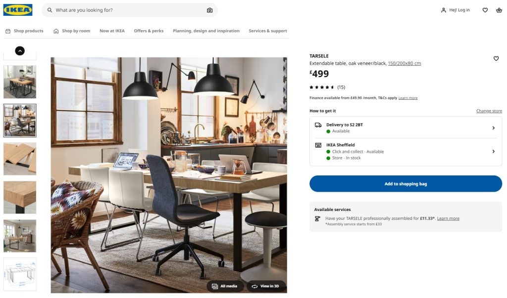
1. Provide High-Resolution, Multi-Angle Images And Lifestyle Shots
Sharp product images allow shoppers to inspect details online just as they would in-store. By doing so, they build trust and drive sales. They also improve page discoverability via visual search, drive engagement, and reduce customer returns.
💡 Extra tips
- Shoot at high resolutions. Large images convert better than smaller ones.
- Include in-scale images allowing customers to assess the product size.
- Include multi-angle and lifestyle shots.
- Enable pinch-zoom on mobile devices and hover-zoom on desktop.
- Add 360° spinning images for high-value items, like furniture or tech. Fibbl has found that it can increase add-to-cart rates by 10.9% and sales by 16%.
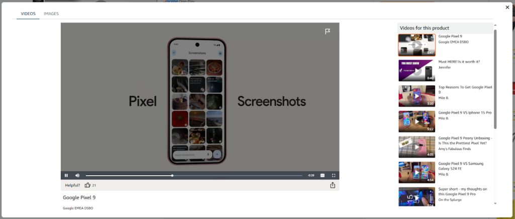
2. Embed Demo Or Explainer Videos For Complex Products
Adding videos to the product page adds clarity, helps users assess its size and understand how it works — key for hesitant online shoppers deciding on unfamiliar or complex items. Companies have seen product pages with videos convert up to 30% better than photo-only ones. And they increase dwell time.
💡 Extra tips
- Keep videos under 90 seconds; show key benefits in the first 15 seconds.
- Host on a fast CDN; autoplay muted, with captions for accessibility.
- Place the video thumbnail in the primary image gallery.
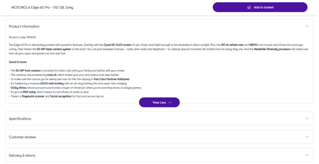
3. Write Benefit-Led, Keyword-Rich Descriptions That Answer Objections
By showcasing the value of the product, a product description helps visitors pick the right products and leads them to the cart. Higher sales, greater satisfaction, fewer returns. Bonus: better SEO. Product descriptions are an opportunity to naturally sprinkle keywords and mentions for higher visibility in the organic and AI search.
💡 Extra tips
- Present benefits in threes (“Lightweight, 100 % organic, machine-washable”).
- Follow with a specs table for technical shoppers.
- Keep jargon out to make it easy to comprehend.
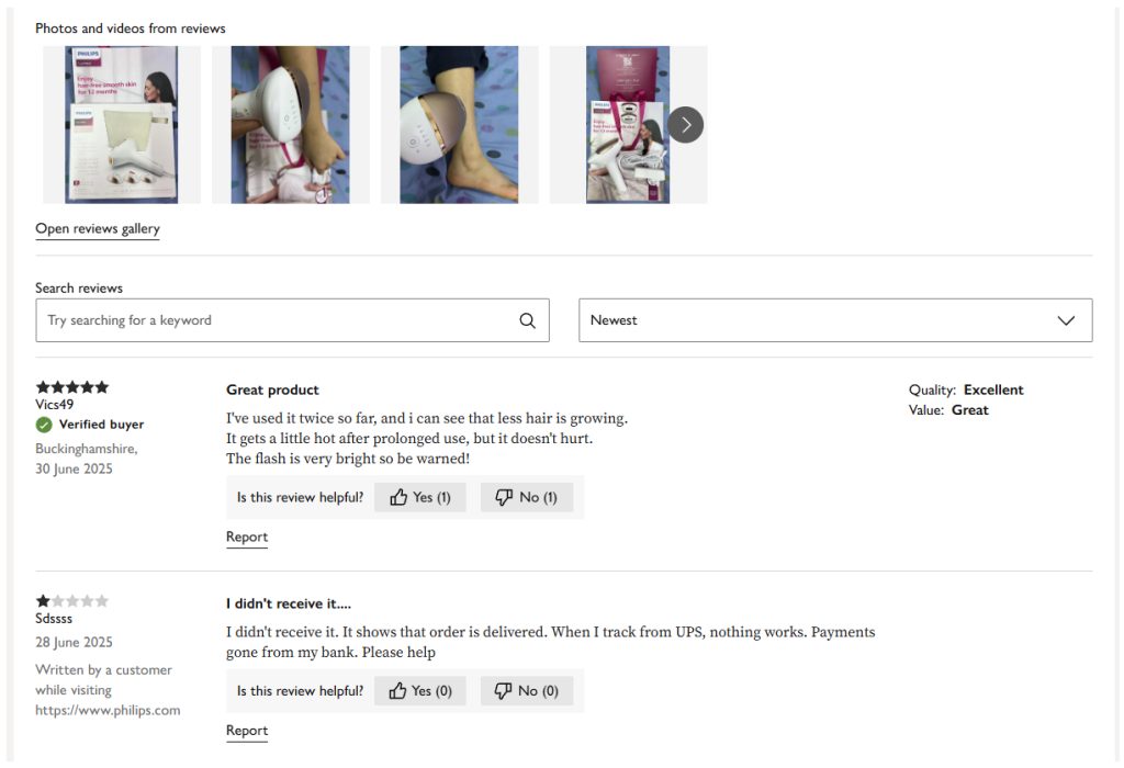
4. Display Ratings, Reviews, And User-Generated Photos Prominently
Displaying social proof, like ratings, reviews, and user-generated images, boosts customer trust — and sales. A 2022 analysis of 1,200 retailer sites found that visitors who interact with UGC convert at a rate 102% higher than average. And those who use the Q&A section saw an astonishing 177% lift in conversions.
💡 Extra tips
- Show the star rating average and count near the price.
- Link to a review tab with filters.
- Incentivise photo reviews via post-purchase emails or loyalty points.
- Highlight “Verified purchase” and surface top positive & critical reviews.
eCommerce Homepage Best Practices
The homepage greets your customers and invites them in. These eCommerce web design best practices will help you build one that sparks excitement and communicates value.
5. Showcase Broad Product Range To Signal Assortment Breadth
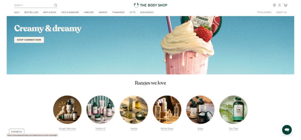
When customers view your eCommerce website, hook them instantly, or they bounce. Showcase your range on the homepage so visitors instantly see what you sell and how much you have to offer.
💡 Extra tips
- Use six to eight product category tiles with representative imagery.
- Aim to showcase at least 40% of your product types.
- Add a “Shop all categories” mega-menu link for full depth.
6. Highlight Best-Sellers, New Arrivals, And Promotions Above The Fold
Showcasing new or best-selling products and promotions on the homepage to speed up their discovery. Best sellers also provide social proof and, consequently, drive more conversions.

💡 Extra tips
- Display “Top 10 Best-sellers” carousel. Enable manual scroll, not auto-rotate, to avoid distracting customers.
- Label new items with a subtle “New” pill.
- Feature one promo banner only — supporting offers can sit lower on the page.
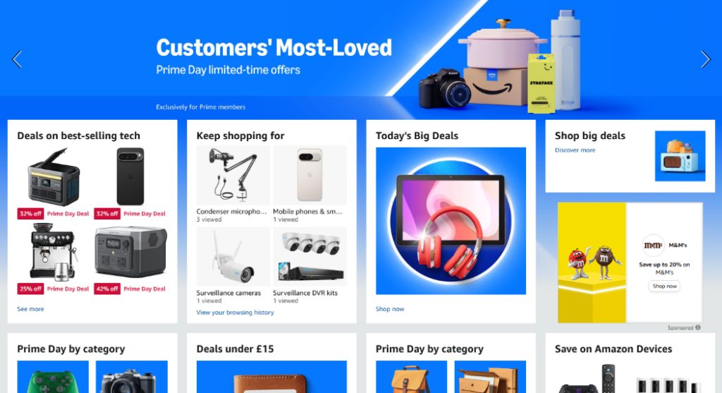
7. Personalize Hero Banners And Recommendation Rows
Personalization is the name of the game. A 2021 study by McKinsey found that 71% of eCommerce customers expect personalized experiences. Why so? A personalized homepage shortens the time needed to find products that satisfy online shoppers’ needs. And it makes them feel understood. Special, even. Which boosts loyalty.
💡 Extra tips
- Segment by returning vs new visitor and swap the hero copy accordingly.
- Use browsing, search, and purchase history to populate and customize product recommendations with Doofinder.
8. Remove Visual Clutter
Eliminate clutter — a core site design best practice. A cleaner page directs visitor attention and reduces mental fatigue. The result? A better user experience and quicker decisions. Customers find relevant products and convert in less time.
💡 Extra tips
- Replace auto-play sliders with static tiles or manual swipe to eliminate distractions.
- Keep one primary CTA in the hero section and place secondary links below.
Site Architecture & Navigation Best Practices
A clear website structure and navigation help customers find the products they need, reducing the bounce risk and increasing sales value.
9. Build a Flat, Logical Category Tree
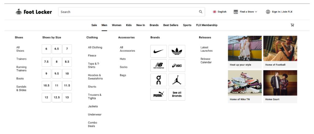
Organize product categories in a shallow, flat tree: top-level departments (e.g., Men, Women, Kids), one layer of clear sub-categories, then filters. Keep labels concise, mirror user language, and display the full “map” in the main menu.
A flat category hierarchy removes navigation friction by shortening the path to products. And it gives Google clean crawl paths — an SEO win.
💡 Extra tips
- Show icons or hero images for top categories.
- Cap depth at three clicks.
- Sort product categories alphabetically over 15 items.
10. Add Always-Visible Search Bar
Put a full-width search field at the top of every page — fixed on scroll, tagged with a clear placeholder prompt (“Search 10,000 products”) and a magnifier icon. Connect it to an AI engine that handles typos, synonyms, and personalizes results based on customer browsing and purchase history.
Relevant search results mean fewer clicks — and higher conversions. Fashion brand Blue Banana saw conversions climb 16% after adding Doofinders AI-powered search to its online store, while Hookain’s rate jumped from 3% to 10%. That’s a 233% lift!
💡 Extra tips
- Keep the search field 30 characters wide on desktop, full-width on mobile.
- Trigger autocomplete after two characters and highlight matching terms.
- Offer voice or image input for quick lookup.
11. Enable Detailed Filters On Results Pages
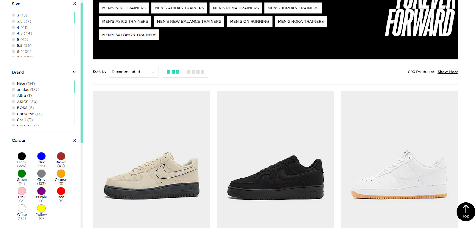
Populate every search or category grid with filter chips for price, size, colour, availability, and rating. Keep the facet panel pinned on desktop, collapsible on mobile, and support multi-select with live result counts. Keep chosen filters as removable pills so shoppers never lose context.
According to Baymard, “inadequate filters” is among the top blockers to purchase decisions. Lack of detailed filtering makes your assortment overwhelming, and finding goods that match customer criteria takes forever, which increases the bounce risk.
💡 Extra tips
- Auto-sort criteria by relevance (e.g., most-stocked sizes first).
- Show a “Clear all” link above the grid.
- Remember last-used filters for returning users.
12. Use Breadcrumbs for Easy Back-Tracking
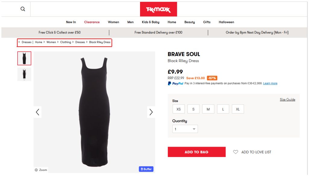
Add a slim breadcrumb trail under the header on every product and category page. Start with Home, show each parent level, and let each crumb link back to its parent. Keep labels short, match menu wording, and mark the path up with BreadcrumbList schema.
Breadcrumbs give shoppers instant orientation, cut dead-end frustration, and help them navigate back to higher-level pages.
💡 Extra tips
- Place breadcrumbs flush left, one line, “›” separators.
- Collapse long paths with an ellipsis after the first level.
- Keep the crumb text under 25 characters.
13. Localize Language/Country Selectors Without Intrusive Pop-Ups
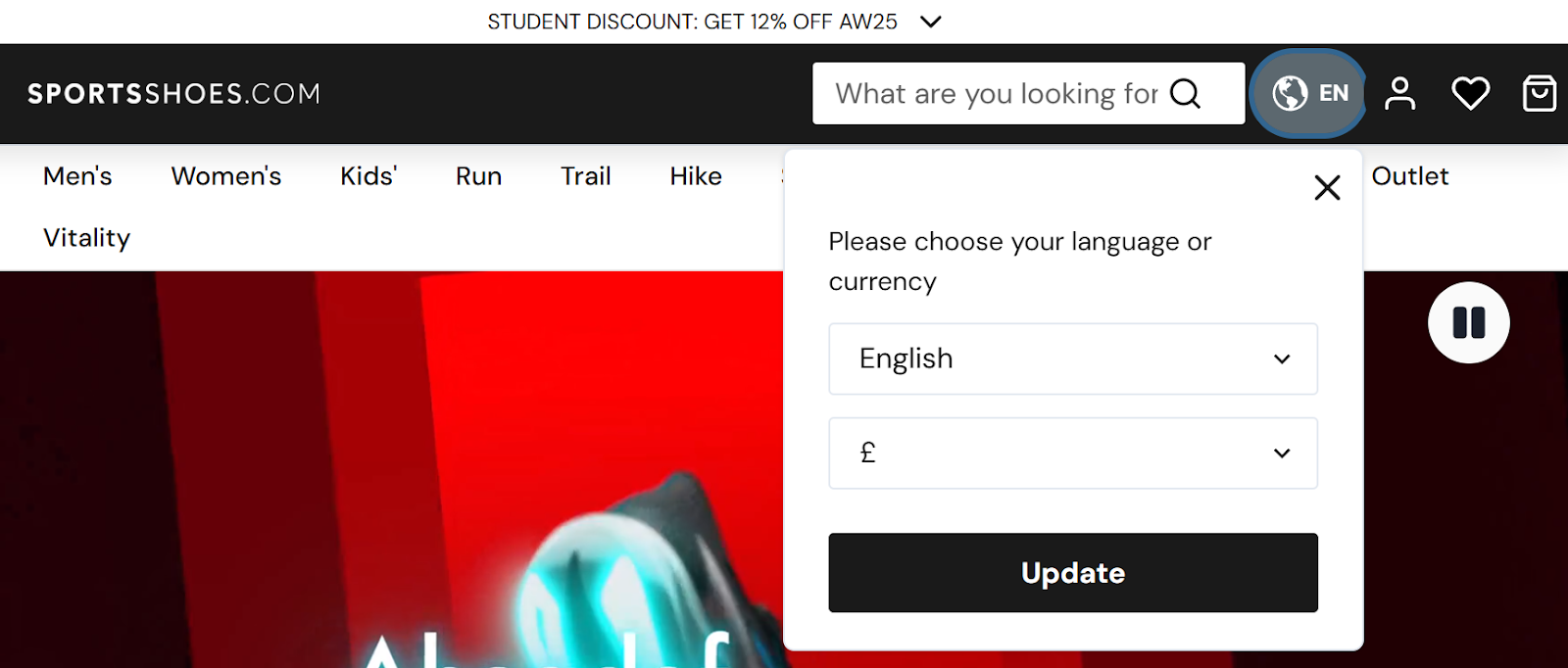
Skip the geo-pop-up modals. They get between the shopper and your product, and users rank them among the most annoying obstacles to buying.
Instead, place a small flag-icon dropdown in the header (and repeat it in the footer) and pre-select visitors’ locale using IP or browser data. If the guess is wrong, this allows them to switch. Store the choice in a cookie and keep prices, tax, and shipping terms synced to that market.
Enabling different currencies makes your eCommerce site more accessible and inviting to international customers — and boosts market reach.
💡 Extra tips
- Keep the dropdown label under 15 chars (“UK £”, “US $”).
- Cache currency and language for 30 days.
- Redirect only on first visit. After that, rely on the cookie.
Checkout Best Practices
Checkout is where interest becomes revenue. Strip away friction so buyers sail smoothly from cart to confirmation.
14. Offer Guest Checkout Without Account Creation
Drop the “Register before paying” wall. Let shoppers move straight from cart to checkout, capturing only email, shipping, and payment details. Pitch account perks — order tracking, saved addresses — after the purchase, not before, so the flow stays smooth.
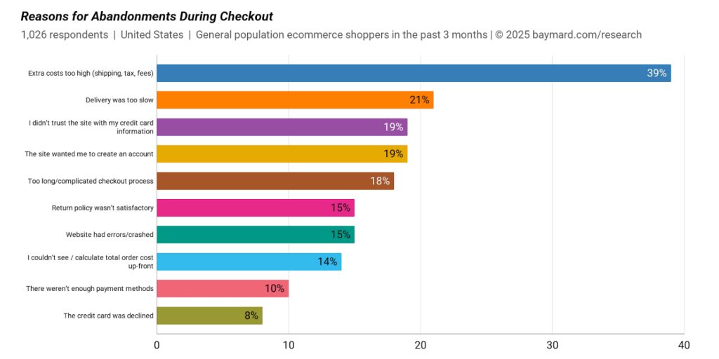
Baymard found that 19% of shoppers abandon carts when sites force sign-up, so removing that hurdle will deliver an instant conversion lift while still giving you the data needed for receipts and remarketing.
💡 Extra tips
- Ask for the email first to send recovery messages.
- Add a one-click “Create account with these details” button on the thank-you page.
- Auto-fill address fields for logged-in return visitors to speed repeat buys.
- Explain optional account benefits in a concise, two-bullet side note.
15. Minimize Form Fields
Streamlined checkouts use 8 forms fields. Average ones 11+.
So, strip the checkout form to the essentials: email (for receipts), shipping address, and payment. Merge first/last name, detect city and postcode automatically, and hide optional extras behind an “Add later” link.
Remember: Each extra field adds friction and nudges shoppers toward abandonment.
💡 Extra tips
- Mark optional fields.
- Auto-fill address with Google Places.
- Place phone number under “Delivery updates (optional)” to lower resistance.
- Use inline verification to reduce errors.
16. Provide Multiple Payment Methods
Enable every mainstream payment option — cards, PayPal, Apple/Google Pay, Buy-Now-Pay-Later (BNPL). Whatever your customers use.
Lack of payment method flexibility is a deal-breaker:
- 70% of consumers consider the availability of their preferred payment method very or extremely influential when choosing online stores.
- 10% card abandonments happen because the retailer doesn’t allow a payment method.
💡 Extra tips
- Display the available payment methods on the product page.
- Localise payment methods for different target markets.
- Pre-select the last method a returning customer used.
17. Use Progress Bar Or Single-Page Checkout
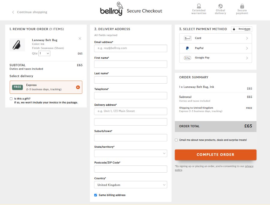
Show shoppers exactly where they are: either surface a slim three-step progress bar (“Cart › Details › Pay”) or collapse the whole flow into one well-organised page.
Single-page checkouts outperform multi-page flows by 20% on BigCommerce stores, and a 2024 Ecommpay/IMRG report showed that consolidating checkout into one page increased conversions from 56% to 61%.
💡 Extra tips
- Anchor the progress bar at the top and highlight the current step.
- Auto-save data between steps for easy edits.
- Keep totals visible, float the Pay button, and auto-scroll to errors.
Performance & Mobile Optimization Best Practices
Customers have little patience for slow and clunky websites, especially on mobile. Let us show you how to build a fast and mobile-friendly eCommerce UX to keep shoppers on page — buying.
18. Target Sub-1-Second Loads
Slow sites bleed customers. When the load time stretches from 1 to 5 seconds, the conversion rate drops by 66%, so every millisecond counts.
Make your website faster by serving pages from a multi-region CDN, embedding only the critical CSS scripts, deferring non-essential JavaScript, and caching the HTML shell with a service worker. Images soak up roughly 70% of an average page’s weight, so convert them to WebP/AVIF. Enable lazy-loading, so they load only when needed.
19. Employ Responsive Design And Fluid Typography
Mobile conversion rates are roughly 12% lower on smartphones than on desktops. Implementing responsive design can help you close the conversion gap, though. Data shows that websites with responsive design have 11% higher conversion rates.
Responsive meaning what exactly? In a nutshell, responsive sites fluidly fit any screen without jarring breakpoints. The text grows or shrinks, always keeping the headlines bold and easy to read. Buttons stay thumb-friendly. Imagines are clear and detailed.
💡 Extra tips
- Design mobile-first, then expand to tablet and desktop.
- Keep tap targets at least a thumb’s width.
- Use two or three consistent font sizes to maintain hierarchy.
- Preview pages on real phones and laptops, not just emulators.
20. Stress-Test Infrastructure For Traffic Spikes
Black Friday, a TikTok shout-out, or a press mention can suddenly surge visitor numbers. And if the load exceeds your website limits? Pages stall, carts error out, and revenue evaporates as frustrated shoppers move on.
You can protect your website by running regular “fire-drill” load tests. Simulate at least 5x normal traffic to spot weak links. Work with your hosting provider to add auto-scaling, push static assets to a CDN, and set real-time uptime alerts so you can act within seconds.
💡 Extra tips
- Schedule a load-test run two weeks before every seasonal push or influencer drop.
- Pipe uptime and error alerts to Slack or Teams so someone acts within minutes, not hours.
- Keep a static “We’re upgrading—back in a flash” landing page ready as a safety net.
Technical SEO Best Practices
Solid technical SEO is essential for your eCommerce website’s discoverability. Follow the best practices to help search engines index, rank, and display your catalog.
21. Add Product-Level Structured Data
Think of structured data as a set of invisible tags on every product page that tells search engines the item’s name, price, stock level, and star rating in plain language they understand.
The main benefit? They enable Google to enhance your SERP snippet with rich results, like the price, stock status, rating, shipping, and returns details. Stores that add product schema often see click-through rates increase and enjoy higher on-page conversions because shoppers arrive knowing the details.

💡 Extra tips
- Add priceValidUntil so deals don’t linger after they expire.
- Validate in Search Console’s Rich Results tester after each release.
- Update price/availability daily via Content API feeds or Google Merchant Center.
22. Keep URLs Short, Descriptive & Case-Consistent
Keep each product and category URL short and clean. Like /shoes/running/nike-pegasus — all lowercase, clear, no tracking clutter or filler.
Tidy, human-readable URLs build trust, are easy to share, and help aid path recall. They also help search engines understand the website structure for easier crawling.
💡 Extra tips
- Use relevant keywords.
- Limit slugs to 60 characters.
- Redirect any parameter-laden links to the canonical version.
- Use hyphens (never underscores) and avoid spaces in URLs.
23. Maintain Clean XML Sitemaps
Generate an XML sitemap that lists only live, canonical product and category links—no staging URLs, no filter parameters. Upload it to Google and Bing each time the file updates, so new SKUs surface fast and retired pages drop out.
A lean sitemap guides crawlers, shortening discovery time for fresh inventory and limiting crawl waste.
💡 Extra tips
- Split into multiple sitemaps if you exceed 50,000 URLs.
- Include <lastmod> dates so bots recrawl changed pages first.
- Disallow faceted URLs in robots.txt and leave them out of the sitemap.
Trust & Compliance Best Practices
Lack of trust is the main reason for cart abandonment. These best practices will help reassure customers that your store is safe, fair, and accountable.
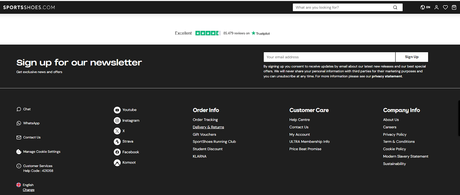
24. Publish Clear Shipping, Returns, Privacy, and FAQ Pages
Clear policies are important not only for legal compliance. They project a professional image, put customers at ease, and can convince them to choose your store over competitors.
Clearly explaining shipping costs, delivery times, return windows, and data-use policies sets the right expectations and helps avoid misunderstandings that hit customer satisfaction levels. And protects you in case of disputes.
💡 Extra tips
- Use plain, easy-to-understand language.
- Link them in the global footer so customers can access them from every product page and checkout step.
- Show a three-bullet “Shipping & Returns” accordion under every Add-to-Cart button.
- Keep FAQ answers under 80 words and link to deeper guides for edge cases.
25. Display Contact Details
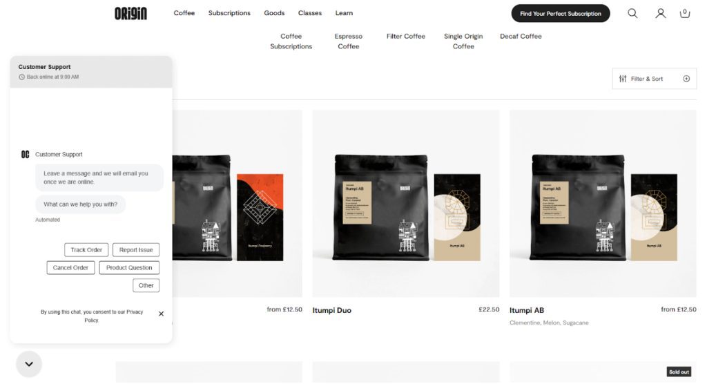
Give shoppers instant proof there’s a real business behind the screen and reduce their hesitation: list a phone number, live-chat link, email, and physical address in both header and footer.
Clear labels (“Questions? Call us”) and one-tap chat icons reassure website visitors that your eCommerce business is trustworthy and help resolve issues that arise. Peace of mind for them means increased sales and fewer returns for you.
💡 Extra tips
- Pin a chat widget to each page.
- Display response-time promises.
- Create a “Meet the team” page for extra authenticity.
- Add operating hours beneath the phone number to set expectations.
26. Collect & Showcase Press Or Certification Badges
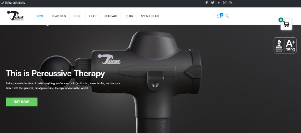
Add trusted-by logos — industry awards, ISO or PCI seals, and recognisable media outlets — to your hero banner, in the footer, and on the checkout page. Link each badge to its verification page so shoppers can confirm authenticity.
Displaying badges establishes credibility and eases doubts.
💡 Extra tips
- Keep logos black and white or at 60% opacity so they don’t overpower CTAs.
- Show no more than six badges to avoid visual clutter.
- Place security seals by payment fields.
- Retire outdated awards and add new recognitions regularly.
Analytics & Iterative Improvement Best Practices
Analytics and experiments uncover what works and what breaks. Discover how to turn data points into higher conversions.
27. Track On-Site Search Queries
Doofinder analytics will help you understand customer search behavior. Think top search terms, most popular products, search terms that need optimizing, and zero-result searches.
Use the insights to identify the relevant keywords for your SEO and paid campaigns, optimize your product catalog to serve more accurate results, or, like Freshly, find in-demand products to add to your inventory:
“Doofinder’s real-time statistics offer new opportunities. In our case, we have reconsidered new product launches thanks to these statistics, as we have found searches for products that we don’t have in our catalog, which we will offer in the future.” – Marc Rodríguez, Digital Product Manager, Freshly
💡 Extra tips
- Export weekly top-null queries; add missing SKUs or redirect to the closest match.
- Feed popular search terms into PPC ad-group keywords.
- Surface high-volume queries in your homepage hero or category tiles.
28. A/B-Test Layouts, Copy & CTAs
A/B tests are controlled experiments where you compare two versions to find the better-performing headlines, button microcopy, and page design elements. So you can pick based on data, not hunches.
Brands report that regular A/B tests are “highly valuable” for increasing conversion rates.
💡 Extra tips
- Test one variable at a time to pinpoint the impact.
- Use sequential testing or multivariate tests to reach conclusions faster.
- Set a primary performance metric, like cart adds or checkout completions, before launching.
29. Monitor Funnel Drop-Offs
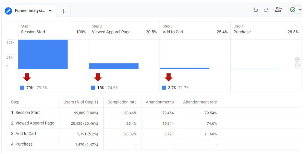
Map every step of the customer journey — from visiting the landing page to payment — and track the percentage that moves forward from one to another.
Visualize the data in Google Analytics to quickly identify the stages where customers abandon and zero in to find the root cause of leaks. Is it the extra costs? Forced account creation? Limited payment methods?
Tackling the friction that causes drop-offs improves conversion rates throughout the funnel, leading to higher sales.
💡 Extra tips
- Set alerts for any step to instantly spot sudden conversion drops.
- Annotate dashboards after major design or price changes.
- Pair quantitative data with qualitative insights from session replays, heatmaps, and surveys to understand the “why.”
30. Schedule Periodic User Testing Sessions
User testing reveals usability issues and conversion optimization opportunities.
Here’s how it works: invite shoppers to complete key tasks on mobile and desktop. Watch in real time or analyze the session recordings later, ask them to think aloud, or do it quietly, and follow up with an interview about their experience.
Fresh eyes will help you find bottlenecks you might be blind to as the website manager.
💡 Extra tips
- Recruit the testers from your customer pool and offer them a thank-you voucher or discount.
- Conduct tests remotely to save on travel and facility hire costs.
- Record screens and faces to capture emotion and hesitation.
- Re-test after fixes to confirm improvements.
Conclusion
Low online visibility, high bounce rates, and abandoned carts aren’t just frustrating — they’re expensive. Left unchecked, they can drain your revenue and stall your growth. But the worst part? Many of these issues stem from small, fixable glitches in your site’s UX.
Fortunately, you now have the playbook. These 30 best eCommerce practices are designed to help you attract more customers, eliminate friction, and guide more visitors all the way to checkout.
If you want to see how Doofinder can help you optimize your eCommerce site for better user experience and conversions, sign up for the free trial!


